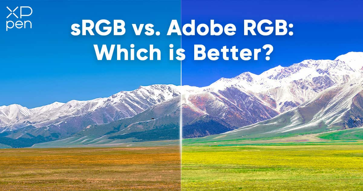
sRGB vs Adobe RGB vs Others: Which Color Space is Best for Photos, Videos, and Printing?
KNOWLEDGEMost people never think about color spaces, but for a graphics designer, video editor, or photographer, getting exactly the right shade of color can be critical.
Nothing is worse than seeing your hard work, which looks amazing on a screen, lose its impact because the colors are wrong when it’s printed or displayed in a different medium.
To solve this, ‘color spaces’ have been developed since the late 20th century, including sRGB, Adobe RGB, and other terms such as DCI-P3 and NTSC. These are used to ensure that colors are consistent and true to the creator’s intent. However, they can be confusing for beginner designers and photographers.
What’s the difference between sRGB vs Adobe RGB or any other color spaces? Here we take you through color spaces, and the issues you need to consider when choosing one.
Understanding the Basics: What is Color Space?
It’s important, first, to understand some of the terminology. A ‘color space’ is, quite simply, a way of organizing colors. It might use names, like Pantone, or numbers, like the RGB format.
However, critically, color spaces are mapped to an absolute point. The term color model is sometimes used, but technically this only refers to the system used, such as the RGB numbers. The addition of an absolute point to anchor the color space means that, for example, sRGB 158,123,181 will be the same purple on every sRGB screen, print, or projection. But that same RGB number may look slightly different in other RGB color spaces.
The differences between color spaces can sometimes be surprisingly large. If your computer and monitor have multiple color spaces, try switching between a few to see the difference they can make.
Why Color Space is Important?
Color space ensures accurate reproduction. This is often critical for the end product of your work. Even small shifts in color can have a dramatic impact on the look of a final image, application, or video, changing things like contrast and legibility, and affecting the quality of the end-user experience.
sRGB vs Adobe RGB vs Others: A Breakdown of Common Color Spaces
Here are some of the more common color spaces you might encounter.
sRGB
Initially created in 1996 for monitors, sRGBit is probably the most widely used color space.
It is ideal for the web and digital applications. However, it has a smaller gamut, or range of color, than other spaces.
Adobe RGB
Developed by Adobe in 1998, it has a much wider range of colors than sRGB. It was designed for reproduction, so it is most often used in print and high-end displays.
Adobe Wide Gamut RGB
Also developed by Adobe, as the name suggests, the Adobe Wide Gamut RGB offers a broader range of color, covering around three-quarters of human-visible colors.
ProPhoto RGB
Designed by Kodak specifically for photography, ProPhoto RGB covers about 90% of the colors likely to be seen in the real-world, making it ideal when accurate representation is important.
DCI-P3
Developed in 2005, the DCI stands for Digital Cinema Initiatives. The standard was intended for digital cinema projection, but is now featured on many monitors. The color space’s main difference with others is in the green primary, which is closer to the perceived green in a color spectrum than many other spaces.
Rec. 2020
Rec. 2020 is a relatively new color space, reflecting its development by the International Telecommunications Union for ultra-high-definition (UHD) TV. It is the emerging standard for television, and has been extended by Rec. 2100 for high-dynamic-range (HDR) TV.
NTSC
An old color space, it was first developed for color TV in 1953. NTSC has a wide color gamut. Several color spaces were developed from it, like SMPTE C, which are still seen on monitors today, meaning you might still sometimes use it.
Choosing Between Adobe RGB and sRGB: Guidelines for Photographers and Video Editors
There are no simple rules when it comes to choosing the right color space, instead you will have to consider several factors to decide which one is best for your needs.
Think about your final medium
If you are a professional photographer, editing images and thinking about print, or a printer or publisher, then Adobe RGB may well be your best option.
If you are editing video, profiles like DCI-P3 and Rec. 2020 are likely to be the best for you. Which one you use might depend on whether your video is destined for the big screen or the television screen.
However, in both cases, if you are working for online use, sRGB might be all you need.
Check industry standards
You should always consider the industry or client your work is for. They may well have standards they expect you have to follow to match their workflows.
Match your equipment’s color spaces
Finally, you’ll need to think about the equipment you are using. The purpose of color spaces is to ensure consistent reproduction of color. So, you must choose a color space supported by everything in your workflow.
How to Choose a Monitor for sRGB and Adobe RGB?
If you work in a visual medium, getting the right screen or monitor is critical. It is what you will be looking at almost all the time you are working, and you need to know that what you see is accurate. Here are a few things that you should consider.
Color space coverage
Color spaces can contain huge numbers of colors. Some are so large their models even include imaginary colors, with values that cannot be physically represented. But you need to ensure you cover enough for the color space for your needs.
Usually this means monitors with at least 99% coverage of the sRGB color space and at least 90% for Adobe RGB.
Check the supported color spaces
Always check the monitor covers sRGB and Adobe RGB. If possible, consider monitors that support other color spaces as well. You might not need them immediately, but they may be handy in the future.
Look for certifications
Several bodies offer certification of color reproduction. Schemes like Calman Verified and Pantone Validated offer an assurance that the display has been tested for their color fidelity.
Don’t forget the basics
Color space is important, but in your search for accurate color representation, don’t overlook other factors. Check specifications like resolution, contrast ratios, and HDR support which will all impact on image quality.
Best Displays with High sRGB and Adobe RGB Metrics for Graphic Designers
At XPPen, we care as much about color reproduction as you do. Our Artist Pro (Gen 2) tablets offer some of the best screens you will find.
They all feature Calman Verified displays, an industry leading 16,384 pressure levels, and the full range of professional drawing tools you expect from XPPen.
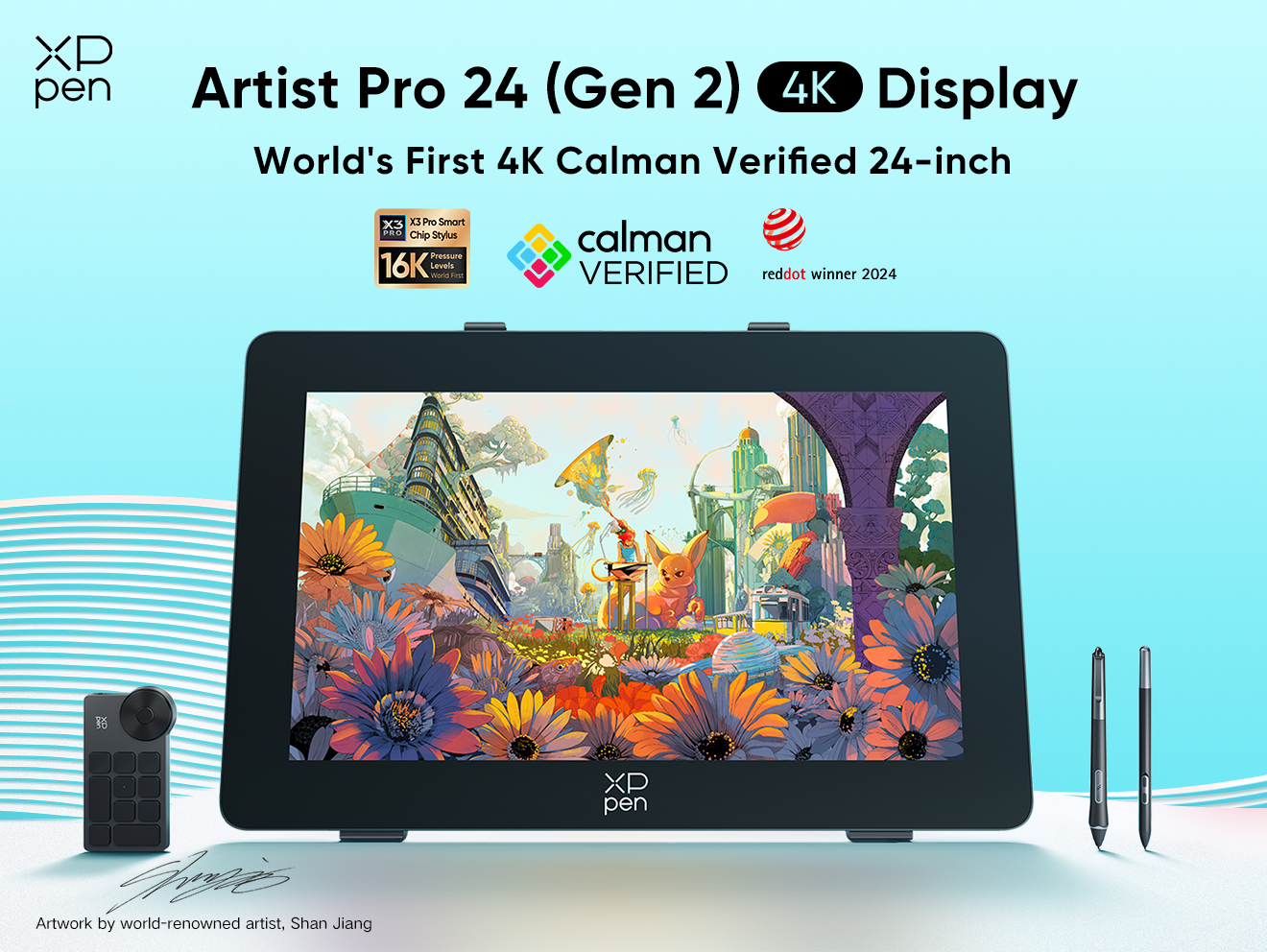
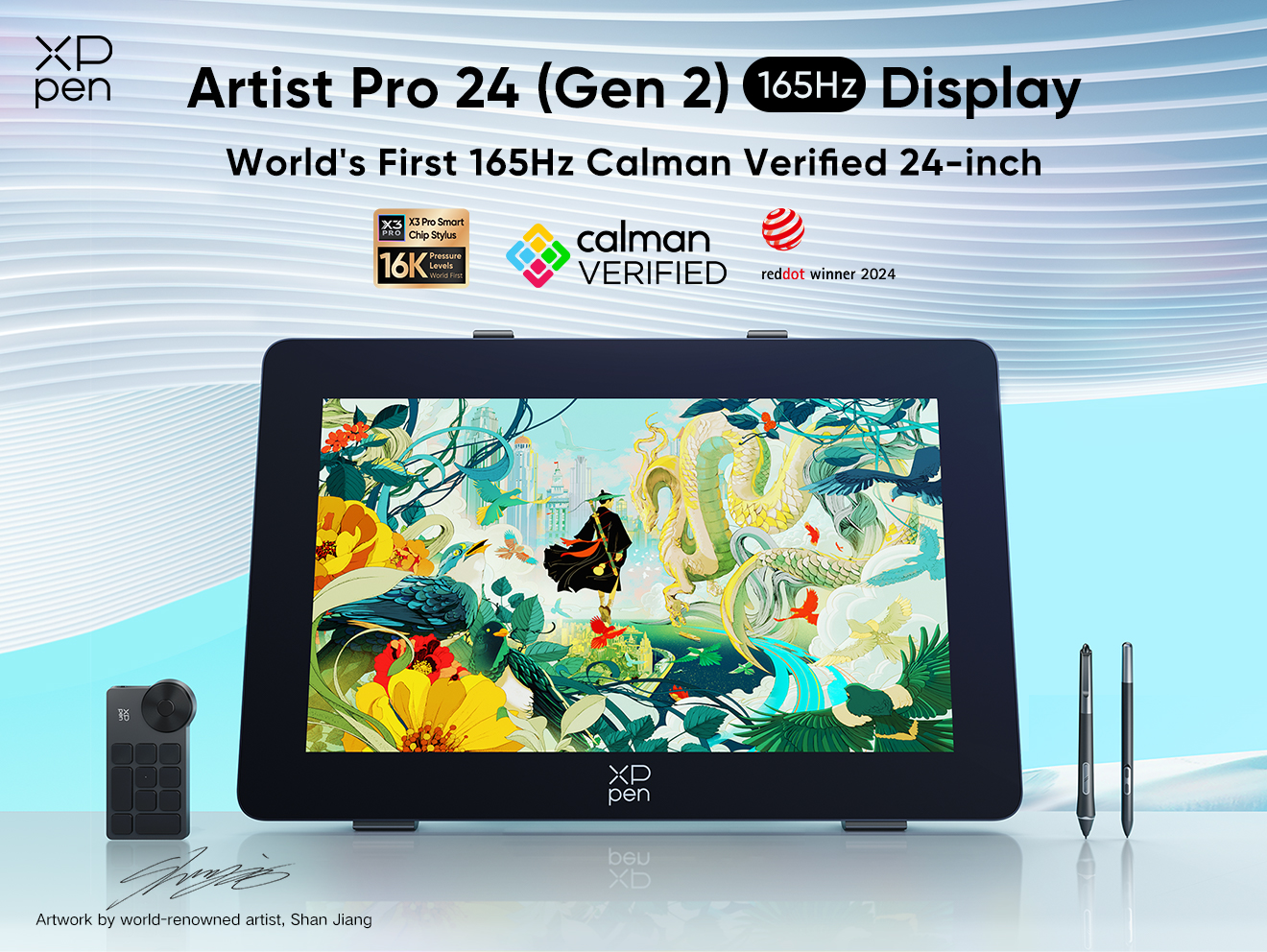
Artist Pro 24 (Gen 2)
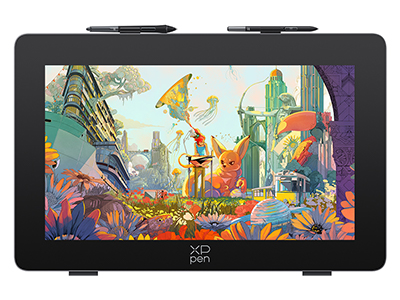
The Artist Pro 24(Gen2) actually comes in two models, the 4K giving you an exquisite image, or the 165MHz with a blazingly fast screen refresh.
The 24-inch 4K drawing monitor has a 3,840 × 2,160 resolution display and a color depth of 1.07 billion colors. If you want precise colors, this is the screen for you, with 99% sRGB and Adobe RGB coverage, as well as 98% of the Display P3 color space.
 The 165Hz drawing tablet features a incredibly high refresh rate that reduces flicker and blur, making it the best IPS screen for even high-frame-rate videos and for dynamic art. With a wonderful resolution, at 2,560 × 1,440 pixels, and a 16.7 million colors, covering 99% sRGB, 99% Adobe RGB, and 94% DCI P3, this drawing monitor brings your visions vividly to life.
 Artist 19 Pro (Gen 2)
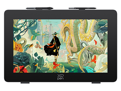
If you are looking for a slightly smaller screen, or working on a budget, then the Artist 19 Pro (Gen 2) packs in the same specs as the Artist Pro 24 (Gen 2) 4K, just in a smaller form factor.
The 19-inch screen has the same resolution and color depth as its bigger brother. It’s a great option for graphic designers and artists that want precision.
Artist 16 Pro (Gen 2)
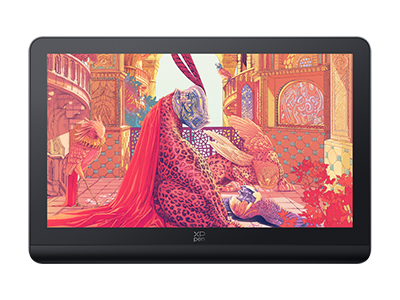
The smallest of our featured models is the 16-inch Artist 16 Pro (Gen 2). The 2560 × 1600, 16:10 screen boasts 99% sRGB, 97% Adobe RGB, and 99% DCI P3 color gamut coverage.
If you are an artist on the move, with limited desk space, or just need the best color reproduction possible, the Artist 16 Pro (Gen 2) is the drawing tablet for you.
FAQs on sRGB, Adobe RGB, and other Color Spaces
How many types of color spaces are there?
Lots! Over time, different color spaces have been created for different needs and new technologies. In practice, however, a few, like Adobe RGB or DCI P3, have become standards for the relevant industries.
What is a color gamut?
The color gamut is the range of colors a device can display, or print. Many gamuts are so large they even have imaginary colors! But it’s important to get the right gamut for you, a large display with featuring gradients may need a larger gamut than, say, digital work for relatively small monitors.
How to calibrate your monitor for more accurate color display?
Monitor calibration can be accomplished using software and tools like colorimeters to ensure your colors are accurate. However, XPPen’s latest professional drawing tablets are Calman Verified, so you know that you have the colors you want, right out of the box.
How to select the right file format for sRGB and Adobe RGB?
There is no point in working in the right color profile if the file format can’t support it. Generally, for a smaller gamut like sRGB, you’ll use formats like JPEG where the lossy compression won’t affect the color profile. For bigger gamuts, like Adobe RGB, you’ll use lossless formats like TIFF or Adobe’s PSD formats.
What does Delta E means on monitors?
Delta E, which is sometimes written as E* or with the Greek symbol as ΔE, is a measure of the perceptible difference between colors. Delta E is a formula that measures various differences between the sample color and the standard of that color. The lower the final number, the more accurate the representation. You should look for a Delta E that’s around two or lower since that’s the level where most people cannot see a difference.
What’s the difference between color gamut area ratio and color gamut coverage ratio?
Color gamut area ratio is a percentage, calculated using the total color gamut and the size of the target color space. This means the figure can be over 100%. For example, if the gamut is one-and-a-half times bigger than the color space, the area ratio would be 150%.
Color gamut coverage ratio measures the proportion of colors within a specific color space that can be displayed. It cannot, therefore, be higher than 100%. If we used the previous monitor, if only half its colors were in the target color space, then it would have a color gamut coverage ratio of only 75%.
If a color space is important to you, the coverage ratio is likely to be the one you need to check carefully.
More Drawing Tips: How to spot elusive colors blended into natural scenery? Check out these amazing nature color palate inspirations!
Conclusion
Whether you are creating art, working with photos, or editing video, using the right color space is essential to ensure people see exactly what you intend.
Identifying the dominant color space for your work and industry, as well as your preferences, is a vital first step. But then you have to find the right display. XPPen’s range all offer high-quality displays, and the Pro Series drawing tablets provide excellent color fidelity whatever your use.
About Us
Originated from 2005, XPPen is now one of the top brands under HANVON UGEE, integrated with digital drawing products, content and service as a globally notable digital brand of digital art innovation.
Learn moreRecommended Articles
KNOWLEDGE Delta E Unveiled: The Science behind Monitor Color Accuracy ROUNDUPS Best Monitors for Video Editing, Gaming & Color Correction KNOWLEDGE Color Depth Deciphered: Why It's Crucial for Artists, Designers and Photographers
