How to Calibrate a Monitor in 5 Steps? A Quick Solution
TIPSHaving accurate monitor calibration is a crucial step to ensure all your creative work succeeds. You want those stunning animations to shine out for an upcoming YouTube show or an engineering schematic to represent a valid color key that all parties involved can easily see.
The trick is ensuring your monitor color calibration maintains the right type of performance. Over time, your color can begin to degrade. New hardware, updates to software, and driver issues can shift calibration.
With the right tools and information at your disposal, you can avoid the common errors of color calibration and enhance your workflow efficiency with the real-tone colors you need.
What are the Basics of Monitor Calibration
The best way to calibrate monitor resources starts by understanding the foundations. When you calibrate, you are adjusting different settings like brightness, contrast, color temperature, and color profiles.
Any time these parameters get “loose,” they result in challenges in translating digital work into physical representations. Consider a logo you’ve been working on for a few days. Everything looks fantastic on your monitor, but when you send it to the printers, that vibrant green used in a new soda pop looks more like a rotten avocado. That is why you want proper calibration.
Another cause of distortion relates to color space. You use color space to map out the different colors on a spectrum based on an “absolute point.” Typical systems for color space are sRGB or Adobe RGB. We wrote an informative article on color spaces and how they affect your monitor performance. There are other color calibration terms you will likely come across, which we’ll cover below.
Understanding the Jargon
Monitor calibration involves a few terms you may want to familiarize yourself with:
Color Accuracy: How well a monitor can display a color to its intended value.
Gamma Settings: Gamma is the tool used to control the brightness of mid-tones on your display.
Color Profiles: Standardized or predetermined sets of color data that determine how colors are displayed for device consistency.
Knowing these terms alone gives you a step up in how to calibrate monitor settings, whether for your private device or to help your entire office get on the same “page” concerning proper color expectations.
What Tools Help with Monitor Calibration
Proper monitor color calibration doesn’t have to happen in a vacuum. There are plenty of tools that will help you calibrate effectively. The two most common fall into categories of hardware or software.
Hardware Color Monitor Tools
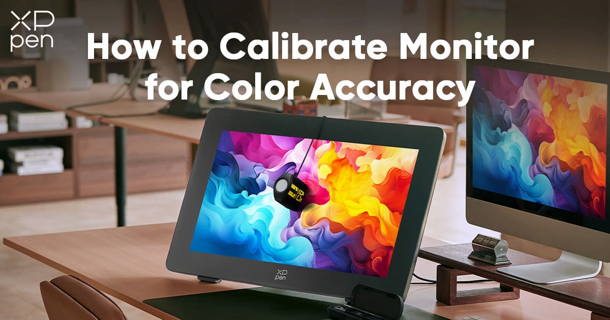
Most physical devices (hardware) you’ll use for monitor calibration include either colorimeters or spectrophotometers. A colorimeter measures what colors are displayed on your screen and compares them to a standardized profile.
In contrast, a spectrophotometer measures the actual wavelength of the color – which is why you see these tools used in film or professional design studios.
Software Color Monitor Tools
Software color monitor tools are a bit different. These work internally within your system, including popular tools like CalMan, DisplayCal, and other monitor manufacturer software like LG’s True Color Pro.
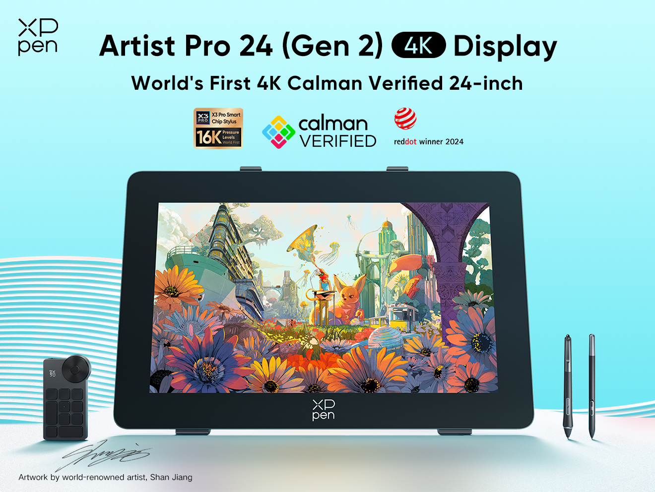
One of the strongest software tools on the market is the X-Color Master from XPPen. Co-developed by XPPen and Calman with those in the art and design industry in mind, the software enhances true-to-life color performance through simple steps. It comes with the Artist Pro 24(Gen2) and is totally free to use.
You’ll use software tools to manage color profiles and gamma settings. There are a lot of free options available to newbies in the monitor color calibration world, or you can choose a paid route for more professional options when working in a specialized field like video editing.
How to Properly Prepare for Calibration
Before you rush into how to calibrate monitor settings, start by setting the stage appropriately. Proper preparation goes a long way to ensure the most accurate color accuracy to avoid errors in communicating design and artwork with others.
Start by Setting Up Your Workspace
Reduce Screen Glare: Try to position any monitor you’re using away from direct sunlight or excessively bright lights around your workspace.
Use Neutral Lighting: Sticking to soft, ambient lighting helps reduce harsh contrasts between your monitor and the surrounding environment. The ideal lighting would use a color temperature similar to daylight (around 6500K).
Find a Neutral Background: To avoid light bouncing off walls, stick to neutral-colored tones that won’t influence your visual perception of colors during calibration.
Pre-Calibration Steps
Now that you have a properly set up workspace, you’ll want to warm up your monitor for around 30 minutes before calibration. Newer models don’t need as much time, but it never hurts to err on the side of caution.
Be sure to reset your monitor calibration to factory defaults, as this is an excellent “base” for building a new color profile.
Finally, ensure all your monitor/device drivers and firmware are as current as possible. You don’t want to go through the process of monitor color calibration, only to have everything reset once an automatic update is run.
Step-by-Step Guide to Color Calibrating Your Design Monitor
Your workplace is ready, and your monitor is properly prepared. Next is when you finally go through calibration.
Step 1: Select the Right Tool (If Applicable)
If you are using a physical tool for calibration, get out your colorimeter or spectrophotometer and set them up according to the manufacturer’s instructions. This way, they are well-prepared for your calibration.
The same is true if you’re running software. Have the program up and running so you can move through settings and compare them to the software.
Step 2: Set the Brightness & Contrast Levels
You’ll want to adjust your monitor’s brightness and contrast levels next. The goal is a neutral white balance that ensures nothing is too dark or overly bright. You may want to use test images you are familiar with or greyscale/brightness charts you can find online.
A good starting point is a brightness level of around 120 cd/m2 and a contrast point that maximizes visuals without losing details in light and dark areas of your test image.
Step 3: Adjust Color Temperature
How to calibrate monitor colors is next. Here, you should set your monitor to 6500K (sometimes known as D65). Most professionals stick to that standard daylight-neutral tone for design and artwork.
If you use a regular printer, ask them what they recommend so you get better color accuracy compared to what will finally be in physical form.
Step 4: Apply a Profile
Many artists and designers use color profiles. These profiles save you a lot of time when working on specific types of color-reliant projects. Maybe you have one color profile for an architectural design in a CAD-related program and another for working in Photoshop or InDesign.
The goal is to work with profiles that ensure consistency. A lot of artists doing print work will have a CMYK profile set up, while digital artists like to use a sRGB profile for social media production.
Just be sure to save your profiles so you can pull them up quickly in the future.
Step 5: Verify the Calibration
The last step in how to calibrate monitor settings is to perform a quick check that everything works as intended. Test images are your best bet, so have a folder on your desktop, laptop, or tablet with your saved profiles and a few test images you know you can rely upon.
Monitor Calibration Tricks for Advanced Users
Luckily, the world of monitor technology has advanced rapidly. You can find many products and systems with amazing and helpful tools built into the devices. Investing in these tools saves you time and ensures you get more precision in your creations.
You’ll find high-end monitors with integrated color sensors (colorimeters) that automate the entire monitor calibration process. In some cases, a wide color gamut is preset, supporting Adobe RGB or DCI-P3 gamuts for greater vibrancy and accuracy.
However, the most advanced monitors will have advanced settings that are on the cutting edge of calibration and ideal for those working in professional fields.
Multi-Monitor Considerations
Many graphic artists and designers enjoy working across multiple monitors to streamline workflow. The challenge is keeping the same level of monitor color calibration as you move from device to device. A few tricks for making this work include:
Using Identical Models: Stick to purchasing the same types of monitors that you know how to make work best.
Calibrate Simultaneously: You can use the same settings, profiles, and software tools across multiple monitors to ensure a solid color match.
Match Viewing Angles: Even with the best tools available, you’ll need to ensure the angles and lighting around different monitors are at the same level.
These tricks will help, but having set profiles is your best bet. That is how you can quickly move from print media to digital formats and video settings along monitor after monitor.
How to Maintain Accurate Monitor Calibration
Ensuring full-color consistency across your monitors is not a “one-and-done” situation. You’ll want to use regular upkeep, so your working environment stays the same.
Be sure to schedule regular calibration about every 4-6 weeks. If you do only professional design work, make that period 2-3 weeks.
Always adjust your settings whenever the local environment around your workspace changes. Even changing seasons can impact natural light in your area.
Keep everything as up to date as possible so you don’t miss out on drivers or calibration software crucial to your device’s accuracy.
Protect your workspace from direct sunlight, high humidity, or excessive dust. That will help reduce degradation over time.
These simple habits ensure you get the most out of your digital work. That will bring out the best logo designs, artwork, animations, and so much more.
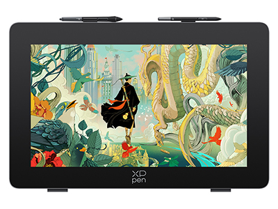
Quick Solution: XPPen Artist Pro 24 Gen 2
Getting the right monitor calibration is much easier when you select a device already on top of its game. The XPPen Artist Pro 24 Gen 2 offers a 4K Ultravision Display and a 165Hz monitor for your choice. Whether you want every single pixel to be clear and accurate or a smoother gaming and streaming experience, you got something that perfectly fulfill your needs.
The full laminated AG Nano Etched Glass ensures you have no visual gap between layers and get an anti-glare surface that protects your screen from external lighting situations.
Once you pair the Dual X3 Pro series Styli, the 16K ultra-sensitive pressure levels give you full capabilities to create stunning artwork or expand your visual presentations.
Highlighted Features:
Premium color control: using XPPen Color Master software to make sure your work will be displayed as you envisioned across three color spaces (sRGB, Adobe RGB, Display P3).
Ergonomic and comfortable design: perfect for sketch work and comes with a flexible angle adjustment stand for your convenience.
Full remote control: facilitating smoother design creation and faster pace workflows.
Abundant colors: The capability to display 1.07 billion colors, allowing for dynamic, lifelike images and smooth subtle color transitions (300cd/m2 brightness).
Industry-standard color precision: The Calman-verified drawing monitors meet the high industry standard followed by famous monitor brands like Benz, ASUS, and Acer, ensuring true-to-life color representation for creative professionals.
Best of all, the XPPen Artist Pro 24 Gen 2 is highly responsive to your needs. It offers up to a 60-degree tilt, supporting more than 200RPS (report rate) details that are so intuitive that it is like you’re drawing on paper.
Color Monitor Calibration Troubleshooting
Tip 1 – Inconsistent Colors Between Devices
Anytime your monitor calibration isn’t carried over to another device, it is probably due to the variations in settings. Make sure all devices are using the same color profile (sRGB, Adobe RGB, etc.) and calibration tools.
Tip 2 – External Lighting Interference
Double-check your ambient lighting at different times of the day. Stick to using neutral, dim light that reduces any glare or reflections on your monitor. If you must, purchase a monitor hood to block light.
Tip 3 – Other Common Monitor Color Calibration Issues
Ghosting: Make sure all your time settings are accurate. Response times will reduce ghosting when you’re working with motion-heavy visuals like animation.
Backlight Bleeding: Make sure all your brightness and contrast levels are accurate to minimize backlight bleeding. This could indicate it is time to upgrade your device.
Blue Tints: If you have too much blue in your monitor, you’ll need a calibration tool (physical) to neutralize those tones.
Conclusion
Achieving optimal monitor calibration is crucial whenever you’re working in a creative or technical field reliant on heavy visual experiences. You want the most accurate color representation so everyone who sees your work or prints materials receives the original concept you envisioned.
Learning how to calibrate monitor settings is essential for the professional design world. While it may take a bit of getting used to at first, the steps outlined above will go a long way to boosting the value of the color you see on your screen.
The best advice is to work with cutting-edge tools that offer a ton of helpful features for your workflow and final output. For that, purchase the XPPen Artist Pro 24 Gen 2 and get the highest color accuracy with professional-grade calibration tools you could ever want.
About Us
Founded in 2005, XPPen is a leading global brand in digital art innovation under Hanvon UGEE. XPPen focuses on the needs of consumers by integrating digital art products, content, and services, specifically targeting Gen-Z digital artists. XPPen currently operates in 163 countries and regions worldwide, boasting a fan base of over 1.5 million and serving more than ten million digital art creators.
Learn moreLooking for the Best Drawing & Design Apps?
Discover essential drawing techniques, expert tips, and the best app recommendations to boost your creativity and master digital art.

