Logo Design 101: Creating Easy Logos to Draw (+ Tips and Inspiration)
TIPSAre you interested in easy logos to draw? Look nowhere else! We'll reveal the secrets of logo design concepts, several categories of simple logo drawing ideas, and digital tools for easy logo drawing in this thorough tutorial.
A Small Trick for Drawing a Logo with the Symmetry Tool [Video Guide]
Click on the video below to see how to draw a simple logo with the Symmetry tool:
Logo design principles demystified
There are no universally established rules for logo design in the industry. But when you compare ordinary logos and those of major brands, you can identify the factors and elements that these iconic logos possess.
If you are looking for inspiration in designing a logo, here are some elements you may consider to get your creative juices flowing!
1. Simplicity
While there are a myriad of ideas you can use to create your logo, you have to remember that complexity does not always equate to the best design. Complex designs might look artistic and visually appealing, but simplicity often prevails in logo design because it is functional and easier to remember.
After all, being "memorable" is the primary mission of a logo. Striking the delicate balance between simplicity and aesthetic appeal is the real challenge in logo design. Having a memorable logo increases recall for the brand, which may help in your brand reputation.
Starbucks has updated its logo four times from 1971 to the present, with the current one being the simplest. Their logo maintained its iconic siren throughout the evolution of their logo so people still recognize their brand immediately.

It's crucial to understand that a brand's logo will need to be applied across a wide range of scenarios—from massive billboards on highways and printed customized merchandise to the tiny browser tabs on a website.
Ensuring that your logo remains clear and instantly recognizable even in the smallest of applications is essential, and this is another reason why a logo's design should avoid excessive complexity.
2. Appropriate & Bold Colors
Imagine if McDonald's iconic yellow arches turned purple. Would you still crave their French fries?
Color is paramount in logo design, as different colors evoke distinct associations. It's crucial to ensure that the associations tied to your logo's colors align with the products or services your brand offers. The right color choice can establish a deeper psychological connection with consumers.
Here are some common colors meanings in logo design:
Red represents:
Passion
Love
Power
Danger
Blue represents:
Calm
Trust
Professionalism
Serenity
Yellow represents:
Happiness
Warmth
Optimism
Creativity
Green represents:
Nature
Health
Eco-friendliness
Growth
Purple represents:
Mystery
Luxury
Creativity
Spirituality
Orange represents:
Vibrancy
Warmth
Positivity
Innovation
Pink represents:
Gentleness
Romance
Beauty
Innocence
Black represents:
Elegance
Luxury
Mystery
Sophistication
White represents:
Purity
Simplicity
Freshness
Clarity


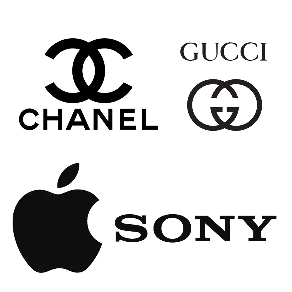
These generally reflect the emotions and perceptions of people toward different colors according to color theory. Although these associations may vary based on culture and personal experiences.
We highly recommend bold and simple color schemes. When you look at the logos of renowned brands across various industries worldwide, you'll notice that most of them employ high saturation and monochromatic color schemes. Even if they incorporate multiple colors, the variety is typically limited to no more than five. If your logo uses too many colors, you risk falling into the "complexity" trap mentioned earlier.
3. Target Audience Suitability
Before developing your brand logo, it is essential to identify your intended audience. Are they male or female, teenagers or middle-aged individuals? What is their income level—high or low? These questions can aid you in designing your logo.
For example, when you are torn with font choices between cuteness and seriousness, try to put yourself in your audience's shoes.
Putting yourself in their position might assist you in making the best option. This applies not only to font selection but also to layout and overall design. Aligning your logo design with the feelings and preferences of your target audience is crucial for creating a logo that resonates with them.
4. Timelessness
Avoid following trends when designing your logo. Your logo is the face of your brand that should withstand the test of time and chasing trends may attract temporary attention, but trends typically have a short lifespan. You intend to establish your brand for a long time, right?
Different types of easy logos ideas
1. Wordmark (Logotype)
A wordmark logo consists solely of the brand name's text, with the font, colors, and typography carefully designed. This type of easy logo relies solely on typography to convey the brand identity.
Examples:

The Coca-Cola logo uses a unique, flowing script font that’s very suitable for their product.

Google's logo features a custom typeface that's instantly recognizable.
2. Lettermark (Monogram)
A lettermark logo is composed of initial letters or abbreviations of the brand name. This type of logo is suitable for brands with longer full names.
Examples:

IBM, which stands for International Business Machines Corporation, showcases its logo with the company's initials arranged boldly in a horizontal fashion.

NASA’s logo is a recognizable lettermark using the acronym for the National Aeronautics and Space Administration.
3. Pictorial Mark (Logo Symbol/Illustrative Mark)
A pictorial mark logo is a type of symbol or icon that can represent a brand, often having a connection with the brand name.
Examples:

Apple's logo is a simple, iconic apple with a bite taken out of it.

While Twitter's current logo is a lettermark, they previously used a blue bird silhouette known as the "Twitter bird" as their logo.
4. Abstract Mark (Abstract Logo)
Abstract mark logos are typically geometric or abstract in nature, devoid of text or representational symbols.
Examples:

Nike's logo is known as the "Swoosh," a simple, abstract checkmark.

While Pepsi has now adopted a combination mark logo, their classic logo of a Pepsi Globe was a circular, multicolored abstract mark.
5. Combination Mark
Combination mark logos consist of more than one element, combining a wordmark with symbols, icons, or abstract graphics.
Examples:

The Burger King logo features the brand's name alongside a stylized burger icon.

Adidas uses a combination mark with the brand's name and three diagonal stripes.
6. Mascot
Mascot logos feature a character or cartoon figure that represents the brand. These mascots are typically friendly and approachable in nature.
Examples:

KFC's logo includes Colonel Sanders as its mascot.

The Michelin Man is a well-known mascot in the tire industry.
These are just a few examples of different types of logos, and many may incorporate elements from multiple categories. The choice of logotype depends on the brand's identity, values, and design goals.
Digital tools for easy logo design
Online free logo maker tools
Designing a logo may not be as challenging as you imagine. Numerous online logo design websites on the internet assist businesses in quickly establishing their brand. You can easily create your own brand logo even if you don't have basic drawing skills.
Here are some famous online free logo maker tools:
Open-source logo libraries
There are many open-source logo libraries available online. However, it's important to note that since these logos are accessible to anyone, there's a possibility that your logo could be identical to someone else's. It's advisable not to use them for your official brand identity.
Here are some online resources for free logos:
Design your logo with XPPen drawing tablets
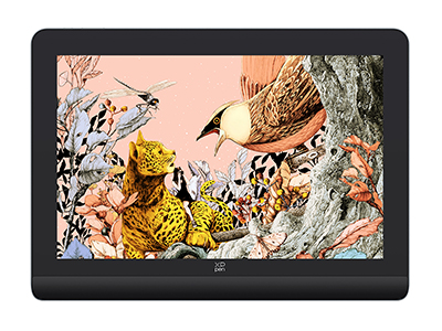
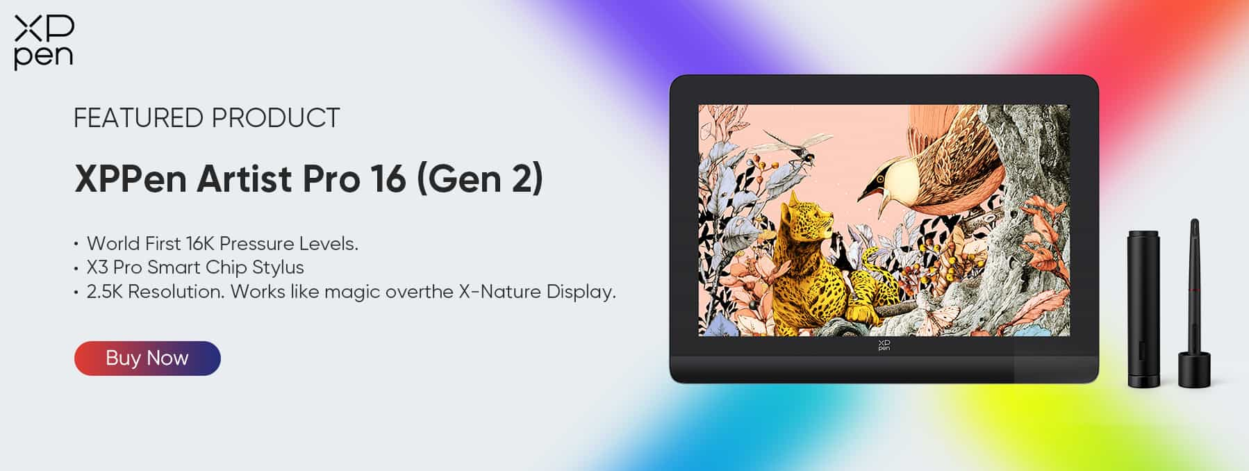
If you're truly committed to creating stunning, easy-to-draw logos that leave a lasting impression, we have a valuable recommendation for you. Consider incorporating the XPPen Artist Pro 16 (Gen 2) drawing tablet into your logo design toolkit.
This remarkable device can take your creative process to the next level, enabling you to bring your logo concepts to life with precision and finesse.
Precision and Control: The XPPen Artist Pro 16 (Gen 2) offers unparalleled precision and control over your creative process. Its high-resolution display and responsive stylus ensure that every line, curve, and detail in your logo design is captured with utmost accuracy. This means your logos will look exactly as you envision them, down to the finest details.
Efficiency: Time is of the essence when it comes to logo design. This drawing tablet streamlines your workflow, allowing you to work efficiently. With customizable shortcut keys and a user-friendly interface, you can access frequently used tools and functions with ease, saving you valuable time during the design process.
Vivid Colors and Sharp Detail: The tablet's vibrant display showcases colors in their truest form, ensuring that your logos pop with eye-catching brilliance. Plus, its high-resolution screen brings out the sharpness and clarity in your designs, making them look professional and captivating.
Compatibility: The XPPen Artist Pro 16 (Gen 2) is compatible with a wide range of design software, ensuring that you can work with your preferred applications seamlessly. Whether you use Adobe Illustrator, CorelDRAW, or other design programs, this tablet is ready to enhance your creative journey.
Portability: Designed with portability in mind, this tablet is lightweight and easy to carry. This means you can take your logo design projects with you wherever you go, allowing for flexibility in your creative process.
Elevate your logo design process with the exceptional capabilities of XPPen's Artist Pro 16 (Gen 2) today!
About Us
Originated from 2005, XPPen is now one of the top brands under HANVON UGEE, integrated with digital drawing products, content and service as a globally notable digital brand of digital art innovation.
Learn more