Understanding the 8 Principles of Design - A Beginner's Guide
KNOWLEDGEAre you the proud owner of a shiny new art tablet? Have you got tons of ideas that you want to realize with your new gadget? Well, as nice as it is just to start creating and see what happens, the best artworks tend to have a structure. You see, even with something as individual and expressive as art and design, there's a science to it. As such, the 8 principles of design offer a roadmap to take your art from good to breathtaking.
As we'll see moving through this article, there are eight basic principles of graphics and layout that you should use in your work, and they ensure everything you put together has harmony and purpose. Whether you're sketching your first masterpiece or exploring new art forms on your digital canvas, these principles exist for a reason, meaning learning them is wise.
So, come with us now as we more closely examine these basic principles of design that can elevate your results to new creative heights.
Why Follow the 8 Principles of Design ?
The 8 principles of art and design represent the backbone of artwork that grabs you by the lapels and gets your attention. Each of the following elements guides creators to make deliberate choices that enhance and amplify the message in their art. So, without further delay, let's see what it is that transforms everyday pieces into memorable works of art.
Principle #1 - Balance
Regardless of whether you're creating an image of an urban landscape or your latest steampunk poster design, it needs to have balance. This ensures that it's easy on the eye and possesses harmony, and there are a few ways to do it.
Symmetrical Balance as the name suggests, this involves creating art with symmetry for a sense of order and calm - ideal for compositions that you intend to have a serene feel.
Asymmetrical Balance conversely, this is achieved by placing differently-sized elements across your artwork to achieve a balance of a different kind. This technique often has the knock-on effect of making your art more dynamic.
Radial Balance - here, the artist creates the main parts of the composition in a circular arrangement around a central point. This draws the viewer’s eye inward and gives the illusion of movement throughout the piece.
Principle #2 - Hierarchy
The next of the 8 principles of design is hierarchy, which essentially means that you place the most important parts of your art in the most prominent positions - so that they grab the viewer's attention. This can be done by experimenting with colour, size or boldness to accentuate each element as intended.
Principle #3 - Contrast
Contrast can also be extremely impactful in making your compositions stand out, and it's all about making use of opposites. You could be talking about dark vs light, bold vs pale or big vs small, and it doesn't have to be complicated to have the desired effect. Getting the contrast right is not simply concerning making things look great, as it can also help to make your designs easier to comprehend.
Principle #4 - Repetition
The importance of rhythm in your pieces is the reason for the existence of the next of the 8 principles of design we look at here. Rhythm's just for music, though, right? Actually, no. In design, rhythm means the repetition of a consistent set of shapes or themes, e.g. lines, circles or colours. This helps to tie all the parts of your artwork together into a cohesive whole.
It’s not just about being repetitive for the sake of it, though. It’s about giving your creations a professional feel where everything seems to fit just right.
Principle #5 - Typography
Depending on what it is you're putting together, you might need to add some text into the piece. As such, the size, font, and colouring of that text can have a big impact, as it sets the tone of your overall design. It wouldn't be an overstatement to say that your typography can completely change the vibe of your artwork from loud to quiet or from serious to fun. How you use words speaks volumes!
Principle #6 - Proximity
Proximity is one of the most important of the 8 principles of design , but what does it mean exactly? Well, it alludes to the fact that you should be grouping related things in the same area. Straight away, this tells the viewer what belongs with what and gives everything a tidy look that can be understood at a glance.
Principle #7 - Space
When conversing with someone, you expect the person you're talking with to breathe between their words. Otherwise, they'll sound a little odd. Artwork is no different, meaning you must include sufficient space around your design elements to allow everything to breathe.
Space can be positive or negative, which might mean leaving space empty around the main parts or filling it. The main aim is to guide your viewer's eyes to where you want them to go.
Principle #8 - Colour
The last, but by no means least of the 8 principles of design is colour. It's an element that can give your art calmness and serenity (with greens and blues) or passion and fire (with reds and oranges), depending on what you're trying to say. Contrasting colours can also make your pieces attention-grabbing, as can using harmonious colours, i.e. those that go well together.
The XPPEN Magic Drawing Pad & Drawing Tablet - Two Fantastic Design Tools
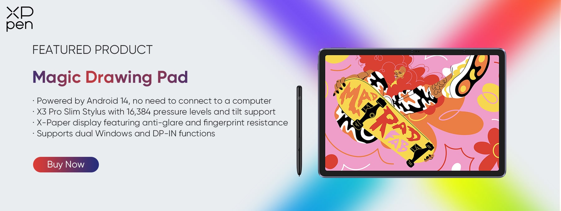
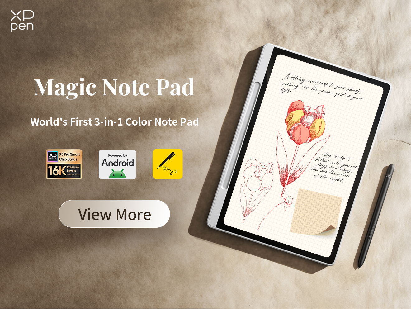
Abiding by the 8 principles of design can truly transform the art you create, and so can the art tech you use to create it. Whether you're a beginner or a seasoned pro, using the right art tablet can elevate your pieces from ordinary to extraordinary. For instance, the XPPen Magic Drawing Pad gives you unmatched 16k pressure levels and tilt support for amazing nuance and control.
With X-Paper technology that feels just like the real thing, a super-slim 590g design, a 12.2-inch high-resolution screen, and all the storage you need for your entire portfolio, it's a great creative companion you can take wherever you go. Coming with the ground-breaking X3 Pro Slim Stylus, there's no better way to unleash your artistic potential.
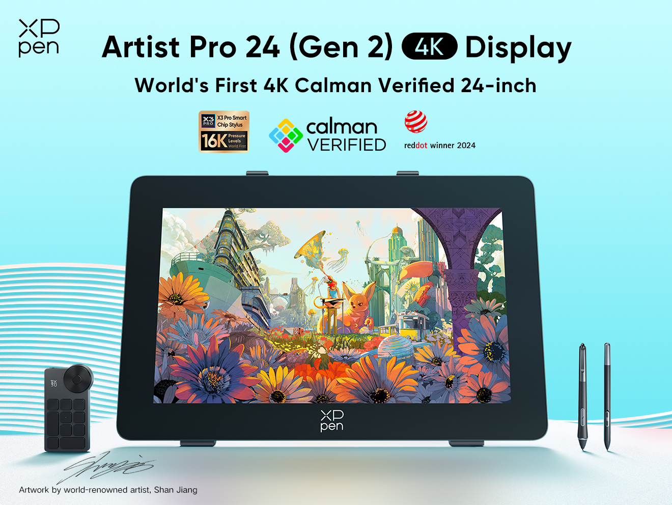
Another top option that works with your PC is the XPPen Deco Pro, which also provides exceptional pressure sensitivity, customizable shortcut keys and sublime precision. It’s also compatible with multiple operating systems, so it's an excellent choice for creative people.
Combining the 8 Basic Principles of Design With Top Design Tech Leads to Better Art
The 8 basic principles of design and art give you the foundation and structure you need to improve and evolve your creations, and the right art tech provides the tools. XPPen tablets like the Magic Drawing Pad are pushing the boundaries of what's possible in digital art, and you can use them to inspire you to realize your creative visions.
If you'd like to learn more about what puts XPPen tablets head and shoulders above the rest, please take a moment to browse our site, that's packed with next-level digital design tech. We hope you found this information on the basic principles of design useful and that you check back with us again soon for more educational articles like this one. Until next time.
About Us
Founded in 2005, XPPen is a leading global brand in digital art innovation under Hanvon UGEE. XPPen focuses on the needs of consumers by integrating digital art products, content, and services, specifically targeting Gen-Z digital artists. XPPen currently operates in 163 countries and regions worldwide, boasting a fan base of over 1.5 million and serving more than ten million digital art creators.
Learn moreLooking for the Best Drawing & Design Apps?
Discover essential drawing techniques, expert tips, and the best app recommendations to boost your creativity and master digital art.
